Article Contents
Responsive design aims to provide users with an optimal reading, navigation and experience regardless of the device being used to view it.
This is accomplished using a mixture of fluid layouts and media queries.
Fluid Layouts.
Fluid layouts are designed using relative measurement units such as percentages or ems, rather than fixed units like pixels or points, this enables them to shrink and grow in response to the current size of the browser’s window (try adjusting your browser’s window size whilst viewing this site.)
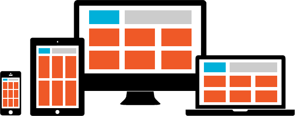
Used on its own a fluid layout will eventually break once the size of the browser’s window falls below a certain point. Consider the three column layout above; viewed on large screened devices such as a desktop or laptop the design is fine, but when viewed on a small screened device such as a tablet (in portrait mode) or a smartphone, the three column design gets too cramped: the design breaks. The size of the browser’s window, measured in pixels, when the design breaks is known as a breakpoint.
If our three column design was able to switch to two columns on medium sized screens, and switch again to a single column on small screened devices then this would solve the problem. Media Queries allow just that.
Media Queries.
Media Queries allow the website to apply different sets of CSS styles based on feedback from the device the site is being viewed on; usually the width of the browser’s window is used.
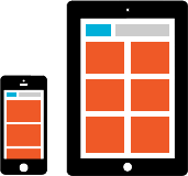
This means we can design additional layouts; a two column layout for medium sized screens and a single column for small screens and have them used when the size of the browser window matches our designated rules.
Device specific media queries.
An early method of working was to match the sets of media queries with the screen dimensions of popular devices. But targeting like this means the designer will likely be forever adding new queries. Every time a new device is introduced it may not fit our existing rule(s) and we end up with a bad looking website.
/* Smartphones (portrait and landscape) */
@media only screen
and (min-device-width : 320px)
and (max-device-width : 480px) {
/* Styles */
}

/* Smartphones (landscape) */
@media only screen
and (min-width : 321px) {
/* Styles */
}

/* Smartphones (portrait) */
@media only screen
and (max-width : 320px) {
/* Styles */
}

/* iPads (portrait and landscape) */
@media only screen
and (min-device-width : 768px)
and (max-device-width : 1024px) {
/* Styles */
}

/* iPads (landscape) */
@media only screen
and (min-device-width : 768px)
and (max-device-width : 1024px)
and (orientation : landscape) {
/* Styles */
}

/* iPads (portrait) */
@media only screen
and (min-device-width : 768px)
and (max-device-width : 1024px)
and (orientation : portrait) {
/* Styles */
}

/* Desktops and laptops */
@media only screen
and (min-width : 1224px) {
/* Styles */
}

/* Large screens */
@media only screen
and (min-width : 1824px) {
/* Styles */
}
[note color=red title=”NOTE”]
The list above is purely for illustrative purposes, It’s better practice to match the sets of media queries with the points at which the layout breaks; its breakpoints.
[/note]
Device agnostic media queries.
Although we’re not being so specific with our media queries it’s still worth bearing in mind the following device types;
- Desktops and large laptops
- Smaller Laptops, tablets in landscape mode, netbooks
- Tablets in portrait mode
- Smartphones.
You can write as many media queries as you need although most designs usually implement around four sets covering what are referred to as major breakpoints.
[note color=grey title=”NOTE”]
Obviously a single column layout with no sidebar requires less work than a complex layout with multiple columns and sidebars.
[/note]
Finding the major breakpoints.
If your approach is desktop-first then open up your design at the largest browser size, and gradually reduce the width of the browser’s window until the design looks crap bad: that’s your first breakpoint. With your media query written and the design now fixed for those dimensions it’s time to reduce again until you find the next breakpoint. Then it’s a case of repeating these steps until the layout works well across all browser dimensions.
And if your approach is mobile-first then of course you start with the smallest browser size and work upwards.
As an example here are the media queries used by this website.
/* Smartphones and tablets in portait */
@media only screen and (max-width: 767px) {
/* Styles */
}

/* Tablets in portrait */
@media only screen and (min-width: 480px) and (max-width: 767px) {
/* Styles */
}

/* Tablets in landscape */
@media only screen and (min-width: 768px) and (max-width: 959px) {
/* Styles */
}
Minor breakpoints.
Depending on the design you may need additional media queries to deal with minor problems, think of minor breakpoints as tweaks to the content within the layout rather than the actual layout itself, examples might be adjusting font sizes, menus, logos etc.
Conclusions.
Just a few years back people were spending money on dedicated ‘mobile’ versions of their websites, basically chopped down versions of their main website with the content organised just for mobile devices.
However people don’t want watered down versions of websites just because they happen to be using a phone. A user might start using a website whilst at their desk, then switch to a mobile on their lunch break to continue their research. Responsive web design should aim for a seamless, unified experience across all devices.